Color Trends for 2019
The colors we choose for our home speak volumes about our personality and style. When it comes to color, some homeowners are more adventurous while others lean toward hues that are mild and understated yet still convey individuality.
Color has a direct impact on our emotions. Some homeowners desire an overall neutral palette that creates a pleasing, tranquil space while others prefer introducing lively hues that provoke an energetic atmosphere. Whatever your preferred palette profile, there are many ways to introduce color into your home.
 Clothing is the catalyst for residential color trends, working its way from fashion into our living spaces. For the past few years, gray has been a forerunner in the neutral color space, replacing browns and beiges that once graced the walls of many a Bay Area home.
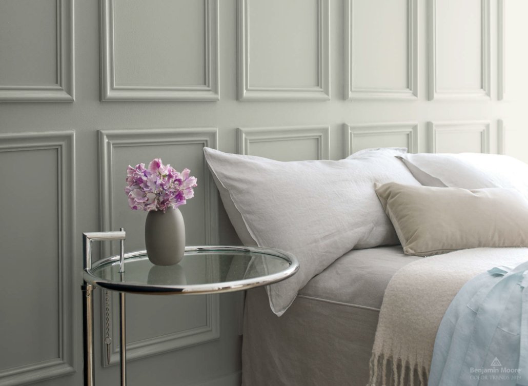
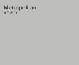
In keeping with this popular color inclination, Benjamin Moore’s Color of 2019 is Metropolitan, an adaptable, stylish, and understated neutral gray. The company also creates a coordinating color palette designed to work beautifully with their starring hue.
Says Ellen O’Neill of Benjamin Moore, “Metropolitan AF-690 emanates nuance, harmony and extravagant ease. Always adaptable, it softens to matte or shimmers with sheen. It’s neutral. It’s understated. It just is. This is color, off-duty.”
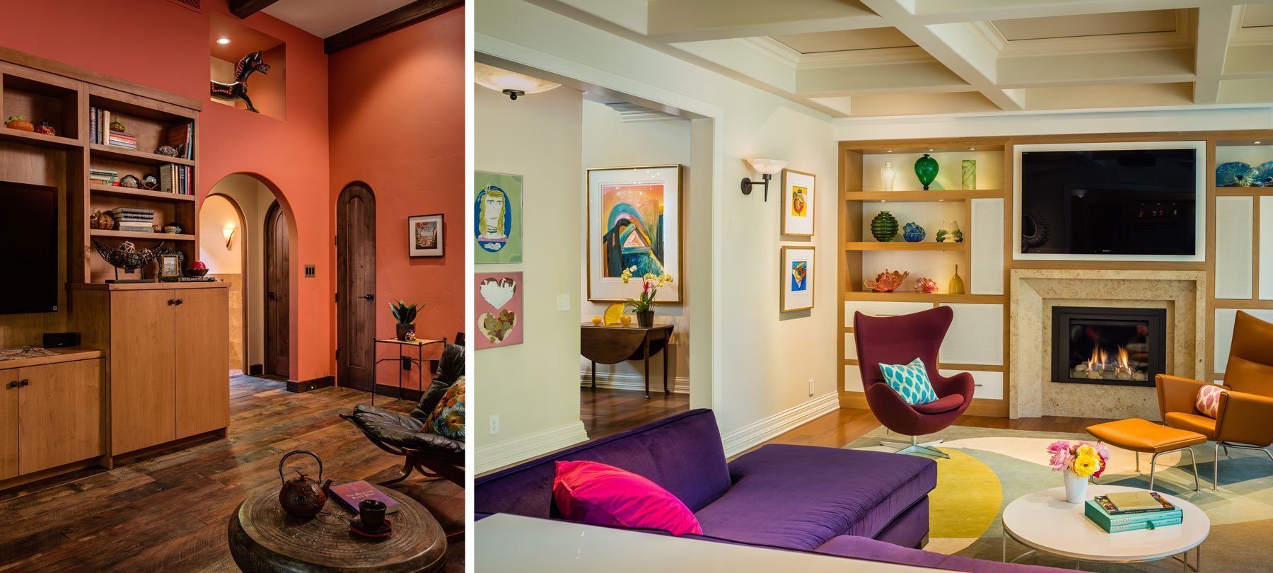
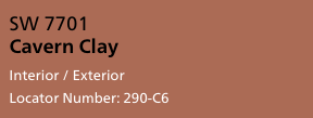 Sherwin Williams has traveled down a different path with their rich terracotta hue, Cavern Clay, the earthy quality of which works well as an accent wall coupled with neutral tones or as a standalone color, infusing a warm sophistication to an entire room.
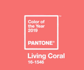 Pantone recently announced that their Color of the Year for 2019 is Living Coral, which they describe as “an animated, life-affirming coral hue with a golden undertone that energizes and enlivens.” Vibrant and at the same time soothing, Living Coral embodies our “need for optimism,” providing a sociable, spirited, and playful manner in which to invite connection and intimacy in our home environment.
Other color palettes are finding their way from the runway into hallways, kitchens, and livings spaces. Turquoise, navy blue, metallic including gold and rose gold, and matte black are trending in popularity as homeowners personalize with pigments in a myriad of manners. Adding vibrant pops of color is a great way to infuse character and playfulness throughout your home. Colored cabinets, entry doors, countertops, accent walls, and tile are all wonderful ways to introduce color.
“Navy and other blue tonal values are making headway especially when accented with gold,” explains Harrell Designer, Sara Jorgensen. “In the kitchen, painted cabinets are taking things by storm. Navy works beautifully as a cabinetry color especially when accentuated with gold hardware.”
In addition to navy, gray and white tones are popular palettes for kitchen cabinets. Islands offer an ideal way to introduce accent colors; wood tones are trending as popular ways in which to highlight kitchen islands.
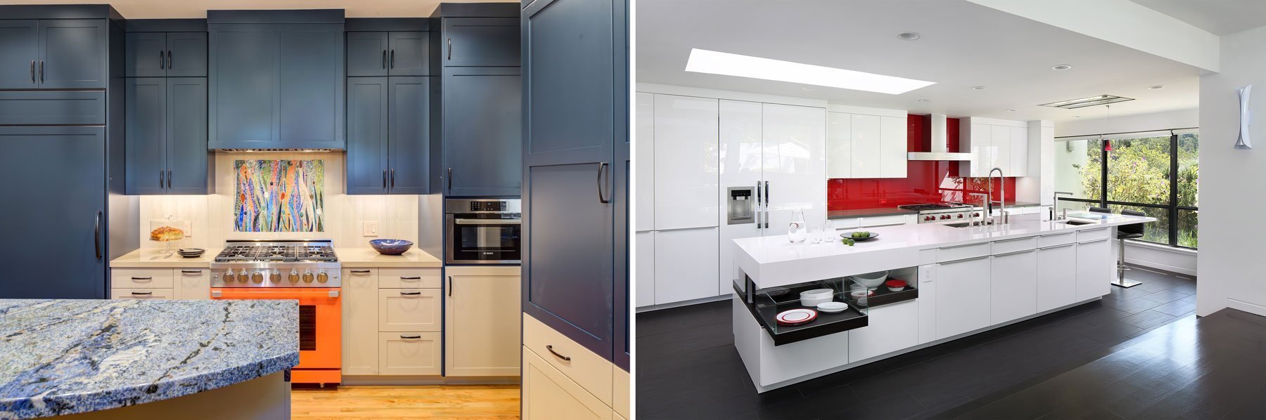
As for metallics, while chrome and satin/brushed nickel remain much-loved among homeowners, brushed brass, rich gold, and the elegance of rose gold are finding a foothold in homes. Drawer pulls and knobs, lighting, and fixtures are classic ways in which to tie in metallic throughout your home.
“Tile is another way to pull in color and texture into a room,” says Sara.
Geometric tiles, especially in black and white, create a high contract focal point. Tile backsplashes behind cooktops can be designed as a beautiful mosaic or a simply stunning accent. Shower niches are another way to imbue color into a bathroom that otherwise may embrace a neutral palette.
Your home is a blank canvas and the colors you choose for your living spaces are as individual as you. The design team at Harrell Design + Build has their fingers on the pulse of the latest trends. Armed with that information plus your personal preferences, we will make your home come alive with color!